A planner isn’t just paper bound together. It’s a small stage where your week plays out, where errands, hopes, and half-formed ideas share space. When the size feels right in your hands, the paper suits your pens, and the layout matches the way your brain sorts tasks, you actually use it. Add planner stickers with a purpose and the whole thing clicks. This isn’t about perfection or aesthetics for their own sake; it’s about building a tool you want to open every day. Here’s how it works.
Choosing a size that fits your real life
Size determines how a planner travels, how much you can write, and how crowded a page feels at 7 p.m. when you’re squeezing in one last note. If you commute or toss your notebook in a bag, you’ll probably appreciate a compact format that disappears into a pocket or small sleeve. It’s easier to keep with you, which means it’s where you are when ideas arrive unannounced. If you tend to work at a desk, a larger format earns its keep with generous lines, wider columns, and room for time-blocking without cramping your handwriting.
Think about your day before you think about numbers. Do you jot quick bullets and move on, or do you sketch little mind maps with arrows and side notes? Fast bullet-ers do well in smaller formats because they don’t need acreage; long-form planners who journal a bit, track moods, or draft project outlines usually feel calmer with more space. Students and folks juggling multiple projects often prefer something in the middle—big enough for weekly overviews and lecture notes, small enough to carry between rooms without feeling silly. That’s your “planner size guide” in plain language: pick the footprint that matches your writing style and your routine, then let measurements confirm the choice rather than drive it.
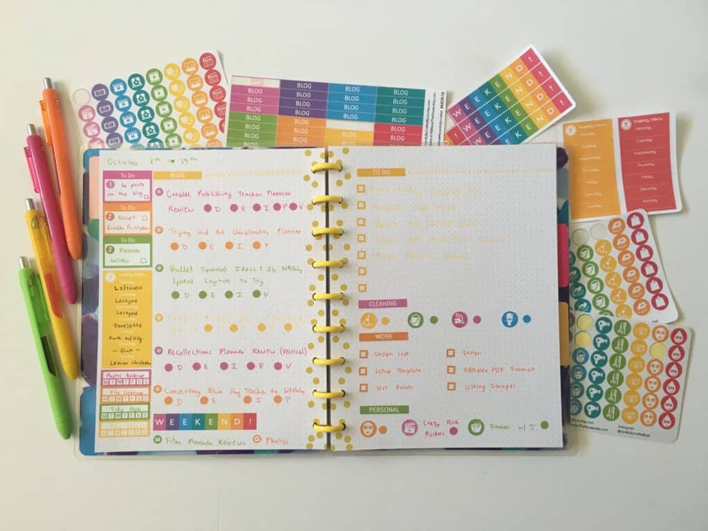
Sticker scale follows size whether we like it or not. On compact pages, small kiss-cut icons, skinny headers, and low-profile flags keep text readable. On roomier spreads, larger quote boxes and day banners make sense because they don’t bulldoze the to-do list. If you’ve ever placed a giant decorative sticker and realized it ate half your Wednesday, you know the feeling. The fix is simple: match the sticker design for planners to the page real estate you actually have. For a creative range of ready-made layouts and coordinated sets, you can explore sticker sheets for sale that cater to planners of every size and style.
Materials and paper that change how it feels to use
Materials are the quiet part of planning. You don’t notice them until something’s off. A cover that scuffs in week two becomes irritating. A binding that won’t lie flat makes you wrestle the book open while the coffee cools. Paper that ghosts or bleeds turns a tidy grid into a shadowy blur. None of that is dramatic enough to rant about, but it slowly pushes you away from the habit—death by a thousand papercuts, literally.
Start with the cover and binding because they set the daily experience. If you write on tiny café tables or in the car before a meeting (not ideal, but it happens), a spiral or coil that flips all the way around is a lifesaver. If you want a cleaner look on the shelf yet still need the pages to stay open, a sewn binding that lies flat will make you feel seen. Softcovers shave weight and flex in a bag; hardcovers handle rough backpacks and busy desks. There’s no moral victory in one or the other—just pick the thing you’ll tolerate touching a hundred times this month.
Paper quality sits at the center of most journaling tips because ink behavior is half the game. Lighter sheets can be fine for gel pens and pencil, but once you bring in juicy brush pens or highlighters, heavier stock reduces ghosting and keeps color from bleeding through. Smooth paper favors fine tips and tight lettering; a bit of tooth gives pencil and brush pens pleasant control. If you like layering stickers with handwritten notes on top, uncoated or lightly coated paper plays nicest; glossy pages can look sharp but sometimes reject certain inks, which leads to smears and mild swearing.
Sticker materials deserve the same attention as the pages. Matte finishes blend into the paper and are easier to write on; gloss pops on tabs, dashboards, and covers where you want shine and durability. Removable adhesive is kinder to your plans when schedules change—because they will—while permanent adhesive makes sense for long-term tabs and labels you don’t want drifting. If you keep planners as keepsakes, acid-free materials are a small but smart choice. All of this rolls up into a simple idea: planner materials aren’t about luxury; they’re about friction. Reduce it, and you’ll plan more.
Design that stays functional when life gets messy
Design is where “personalized planners” stop being a Pinterest mood and start helping you think. Color is the easiest lever. Assign a single accent color to a category—work, home, fitness, finances—and repeat it. You’re training your eyes to find patterns faster. The palette can be muted, bright, or pastel; consistency matters more than style. If you’re tempted to try five themes in five weeks, go ahead, but notice which one made you plan without effort. That’s the keeper.
Layout matters because days aren’t equal. Weekly spreads let you scan everything at once and notice where space is tight; daily pages give breathing room for lists, meal notes, or a quick paragraph about the day. Neither is better. The right choice depends on how frequently you switch contexts and how many moving parts you track. If you’re in a heavy project season, consider repeating the same small “status box” in the same place on each spread. It sounds boring, but repetition lowers decision fatigue. When your brain already knows where “three priorities” goes, it can spend energy on the priorities, not on layout roulette.
Planner stickers play a supporting role here. Icons and small labels should clarify the page, not steal it. Keep them small enough that the task remains the star. If you need motivation, a single quote sticker near the bottom of a daily page is stronger than five scattered across the week. For decorative folks who enjoy a scrapbook vibe, lean into layering—just keep the functional information unburied. If you want a quick rule of thumb, try this: place the functional pieces first (headers, time bars, trackers), then layer decorative elements into the margins and corners that remain. It sounds restrictive, but it keeps plans legible on a Wednesday night when you’re tired and scanning for the next thing.
Finish and surface pairings are practical, not fussy. Matte stickers on uncoated paper make notes easy to write and read. Glossy stickers look great on covers and laminated dividers where smudge risk is low and you want color to snap. For people who rearrange a lot, removable adhesive keeps pages intact when plans shift. For people who commit, permanent adhesive reduces edge curl and wandering labels. This is “custom journal design” at ground level—not fancy techniques, just materials and choices that match your habits.
Bringing it together without turning it into a project
If you’ve made it this far, you probably want a simple setup you can maintain. Here’s the straightforward approach. Pick a size that matches your day, not your aspirational handwriting. Choose a binding that lies flat where you actually write. Select paper that agrees with your favorite pen; test a corner if you’re unsure. Add a handful of planner stickers that solve real problems: day headers if you forget what page you’re on, tiny icons for recurring categories, a tracker you’ll genuinely use. Keep the first spread light on decoration so you can see what you reach for and what you ignore. The second spread can get braver.
You don’t need to measure every box or buy a dozen kits. Start with one sheet of functional stickers in your core color palette and one sheet of decorative elements you actually like. If your planner is compact, aim for small icons and slim headers so text remains readable. If your planner is larger, add a few bold elements—quote boxes, wide banners, a seasonal accent—without covering half the schedule. When a week goes sideways, don’t treat it like a failure; turn the page and keep going. Real planning has smudges, crossed-out appointments, and the occasional sticker placed slightly crooked. It’s fine. The goal is momentum, not museum quality.
Over time, your pages will teach you. If you notice unused boxes every Friday, shrink them or replace them with a notes block. If your eyes constantly hunt for bills or workouts, give those categories their own color and icon. That’s the quiet magic of a planner: small, repeated adjustments that make thinking easier. And yes, it’s okay to change your mind midyear. Most of us do. The difference between a tool and a toy is whether it earns its place on your desk; your choices about size, materials, and sticker design are what help it earn that place.
In my opinion, the best “planner materials” and “journaling tips” are the ones you don’t notice after a week because they’ve faded into the background and your routine is smoother. If the book feels good to open, the paper takes your ink, the spread makes sense at a glance, and the stickers reinforce the logic rather than distract from it, you’ve built something useful. That’s the entire point of personalized planners: they match you. When they match you, you keep going.
Bottom line: pick a size you’ll carry, paper your pens respect, a binding that doesn’t fight you, and planner stickers that clarify rather than clutter. Keep your color system consistent, let your layout repeat until it becomes muscle memory, and let decoration serve the plan instead of replacing it. If it helps, call this a living “planner size guide” you’ll refine as you work. The pages don’t have to be perfect; they just have to help you finish the day with a little more clarity than you started.